- 《CSS世界》中提到的实用技巧
- 清除浮动
- 文字少时居中,多时靠左
- 凹凸man
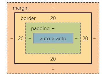
- 让padding、border不影响盒模型的大小
- height:100%占屏效果
- 任意高度元素展开
- 优雅的图片未加载或加载失败效果
- CSS的悬浮图片替换效果
- 利于SEO的“替换元素”标题logo
- 高兼容、自动等宽、底部对齐的柱状图
- 高兼容性的加载效果
- 增大点击区域
- 不使用伪元素的“三道杠”和”圆点“效果
- 导航栏去除右边多余尺寸
- 正确的滚动底部留白方式
- 高兼容的多栏等高
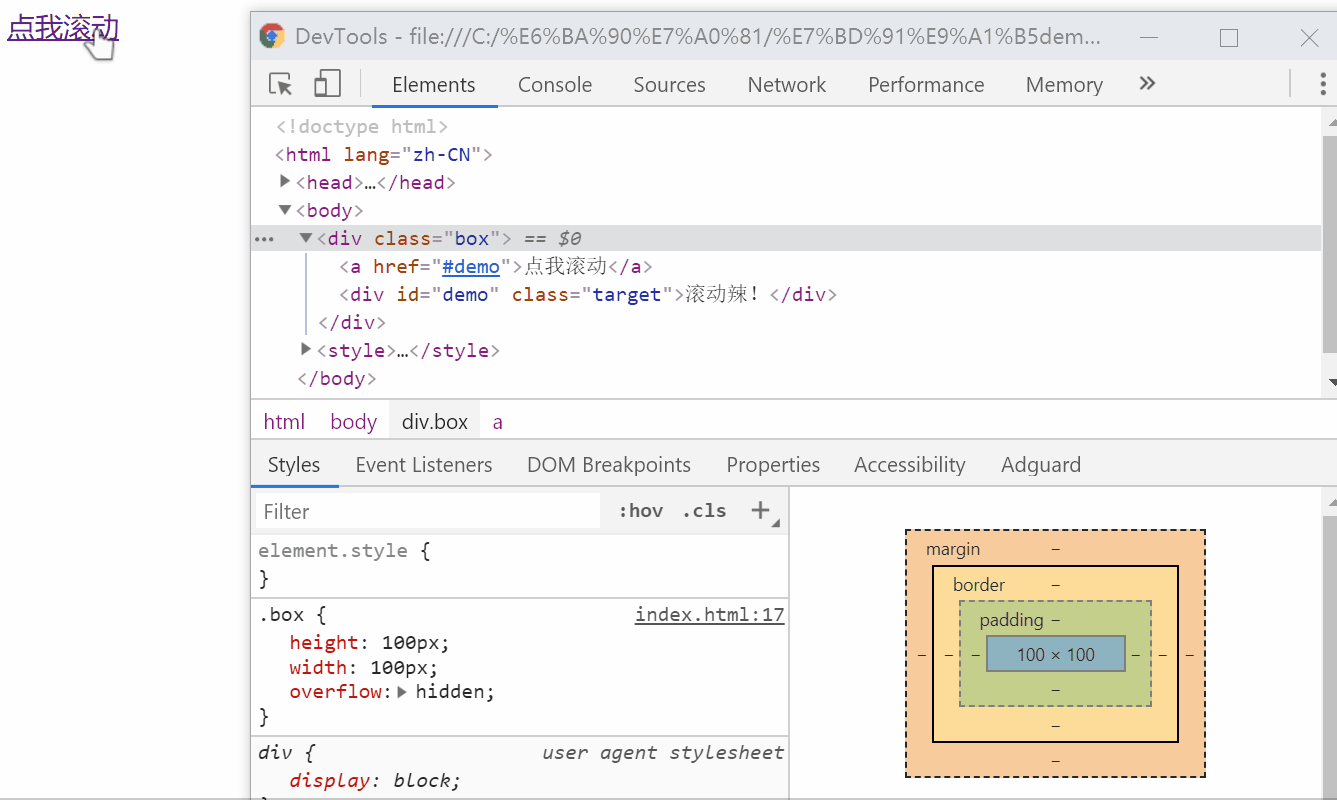
- 正确的块级元素右对齐
- 图片上传增加框
- 不影响背景图片位置设置边距
- border制作梯形,各种三角形
- 高兼容双栏,一边等宽一边自适应,等高布局
- 内联元素“近似”垂直居中
- 多行内容“近似”垂直居中
- 容器内图片的垂直方向间隙问题
- 图标文字对齐
- 永远居中的弹框
- 文字环绕图片
- 利用overflow:hidden自定义滚动条
- 通过label实现的选项卡效果
- “包含块”的绝对定位元素“一柱擎天”问题
- “无依赖绝对定位”的表单验证应用
- 主体页面侧边栏
- 不通过width和height设置窗体全占用?
- margin:auto水平垂直居中
- 纸张卷边阴影
- 隐藏文字
- 解决text-decoration下划线和文本重叠
- 自动将输入的小写字母转换大写
- 价格场景下的首个符号选择器
- 元素隐藏同时资源不加载
- 头像裁剪矩形镂空效果
- 自定义光标
- 修改水平流到垂直流
《CSS世界》中提到的实用技巧
以下技巧的具体原理和解释请支持张老师的《CSS世界》,在这里不做展开。
一部分没录入的技巧原因是部分属性将被标准废弃,如:clip。还有一部分是因为个人觉得兼容性不好,而且CSS3的一些特性可以弥补,比如text-align:justify;,完全可以用flex布局实现。
应网友要求,加入部分配图,配图原则是因为防止代码量大而去掉的无用属性(如背景颜色)造成的一眼望去好像是没效果的技巧会加上一些配图,如果大家测试过程中遇到没有效果的现象,建议通过审查元素去查看以下元素的几何属性。还有一些是复制粘贴就可以得到的效果我就不截图了(想到可能读者懒的问题,我把格式写成下面的主要目的是直接复制到body中就可以用了),因为篇幅太太太太太长了。
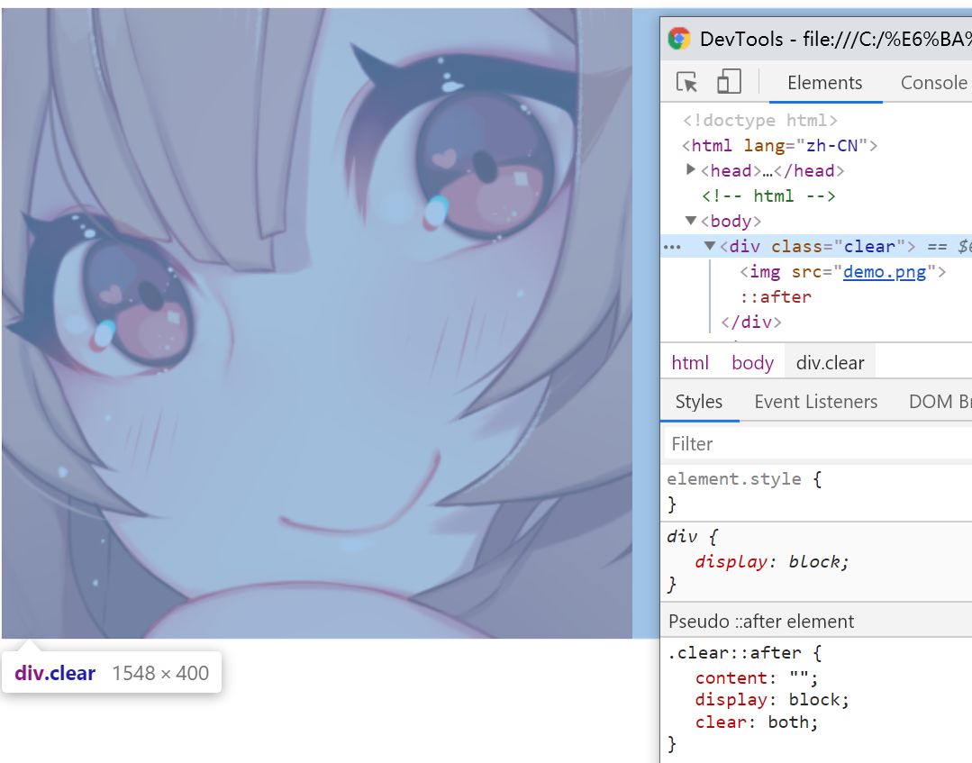
清除浮动
主要用于子元素浮动(float)之后,父元素无法撑起高度和宽度。
<!-- html -->
<div class="clear">
    <img src="demo.gif">
</div>

<!-- CSS -->
<style>
    img {
        float: left;
    }
    /* 清除浮动 */
    .clear::after {
      content: "";
      display: block;
      clear: both;
    }
</style>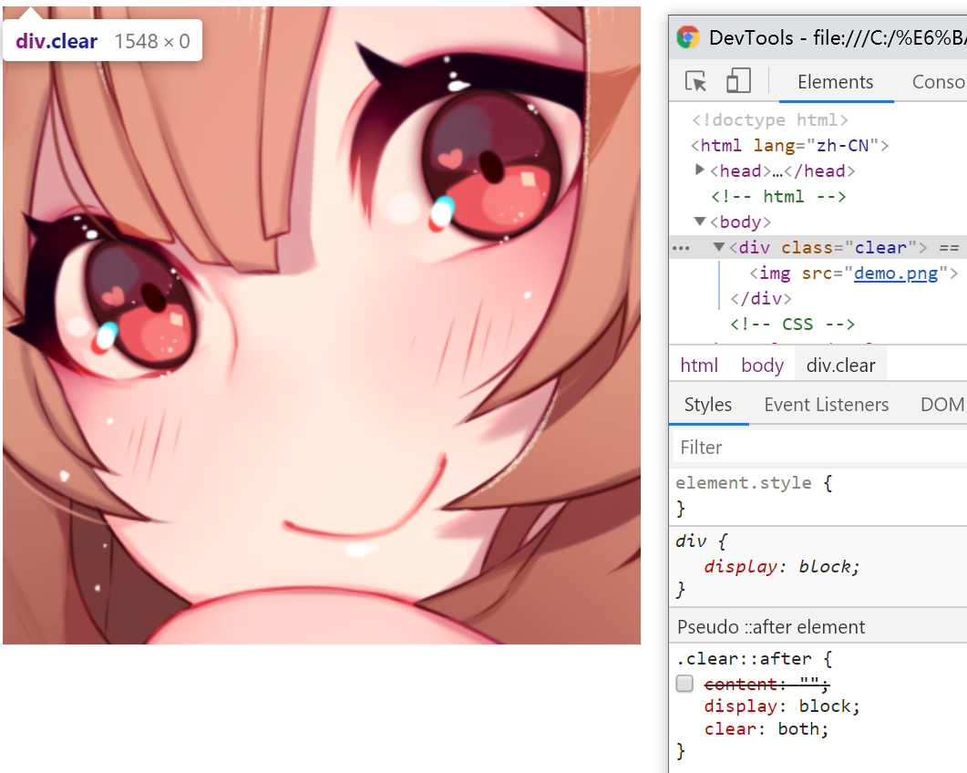
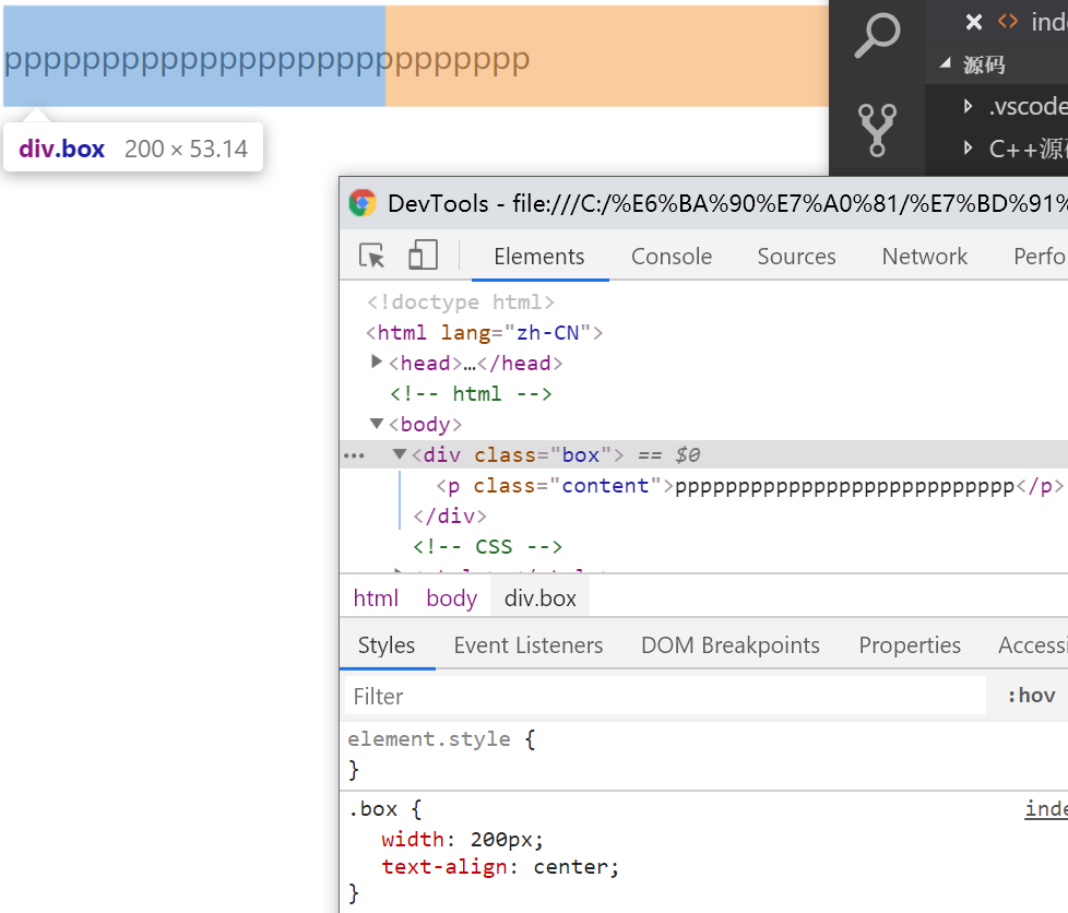
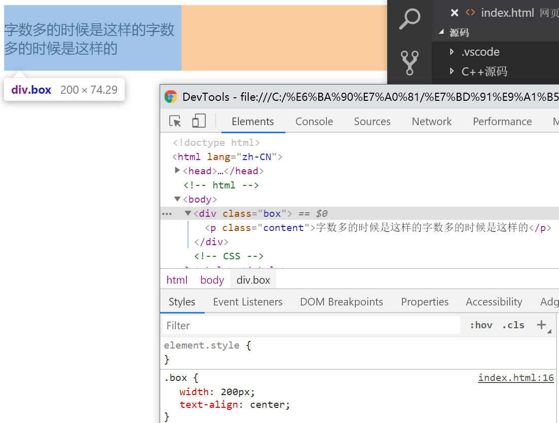
文字少时居中,多时靠左
因为div嵌套着p,所以p的尺寸并不会超过div。但是要注意,当p的内容为英文单词组成的时候,如果单词过长,比如“pppppppppppppppppppppppppppp”这种甚至更长,会被视为一个单位而造成超出div的尺寸。
如果你想要英文字符也有中文字符的效果的话,在p使用“word-break:break-all”。
<!-- html -->
<div class="box">
    <p class="content"></p>
</div>

<!-- CSS -->
<style>
    .box {
        text-align: center;
    }
    .content {
        display: inline-block;
        text-align: left;
    }
</style>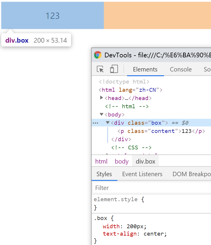
凹凸man
目的在于制造一个凹或者凸的形状,利用了”2“中英文单词不换行的特性
<!-- html -->
<div class='ao'></div>

<!-- CSS -->
<style>
    .ao {
        display: inline-block;
        width: 0;
    }
    .ao::before {
        content: "love 你 love";
        outline: 2px solid #000;
        color: #fff;
    }
</style>
让padding、border不影响盒模型的大小
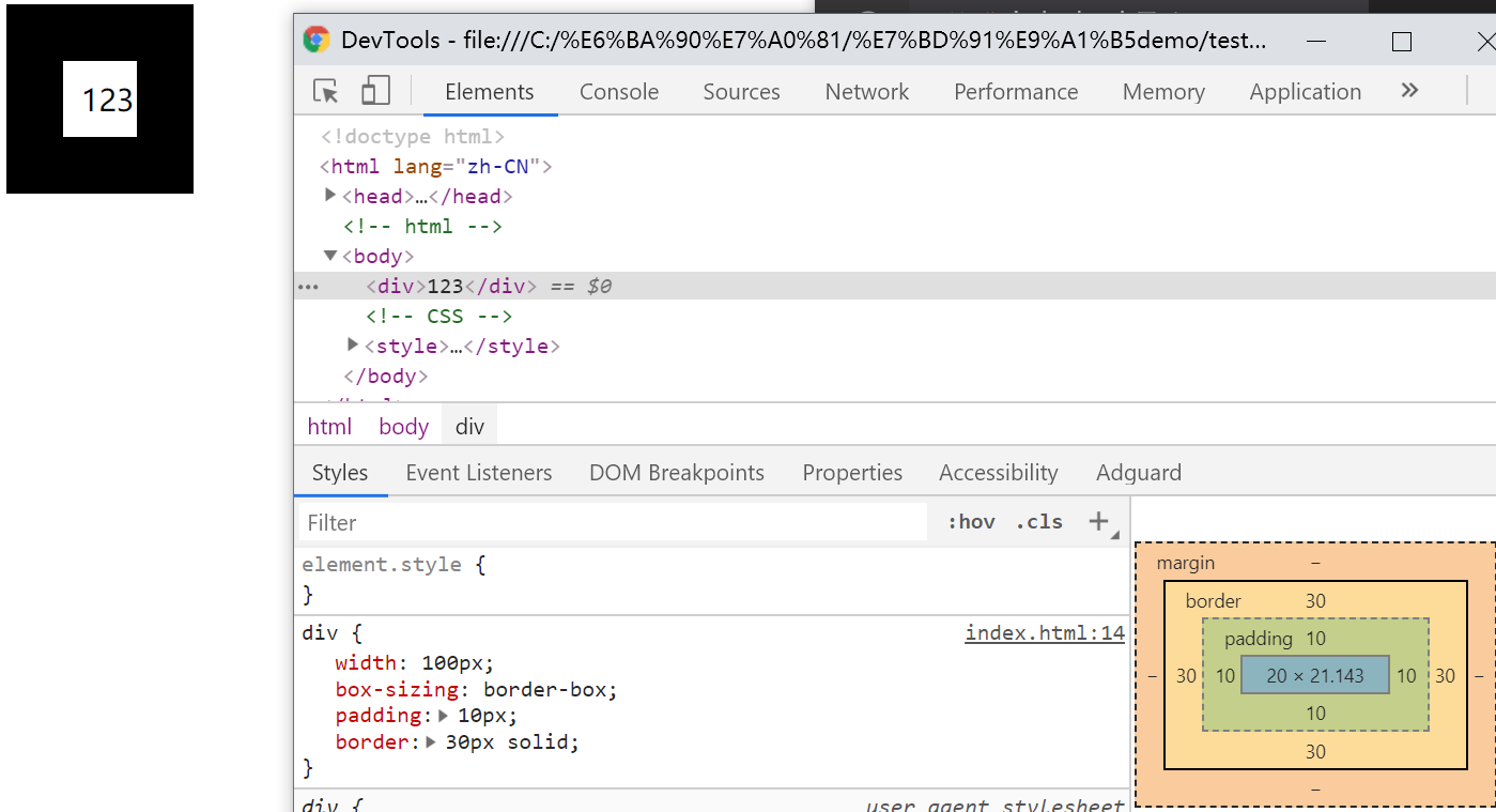
相信这点大部分人都知道,但是有一些奇怪的行为,比如说width<content+padding会怎样?事实上当padding+border>width时,元素的渲染大小(Chrome下)为padding+border;而padding+border<width时,会将剩余空间分配给content。
<!-- html -->
<div></div>

<!-- CSS -->
<style>
    div {
        box-sizing: border-box;
    }
</style>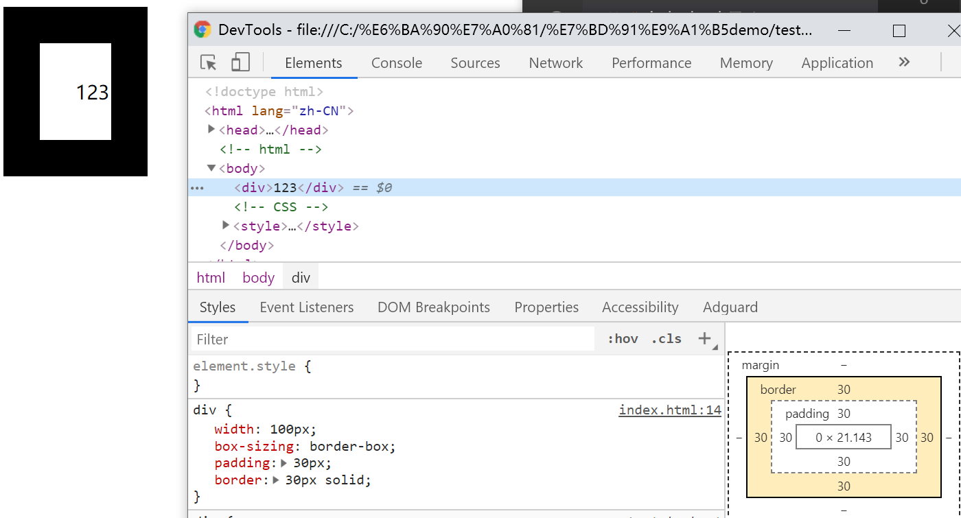
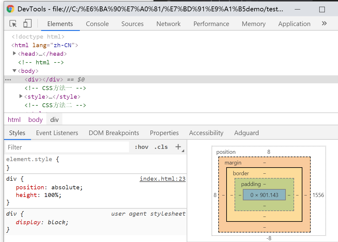
height:100%占屏效果
<!-- html -->
<div></div>

<!-- CSS方法一 -->
<style>
    html,body {
        height: 100%;
    }
    div {
        height: 100%
    }
</style>
<!-- CSS方法二 -->
<style>
    div {
        position: absolute;
        height: 100%;
    }
</style>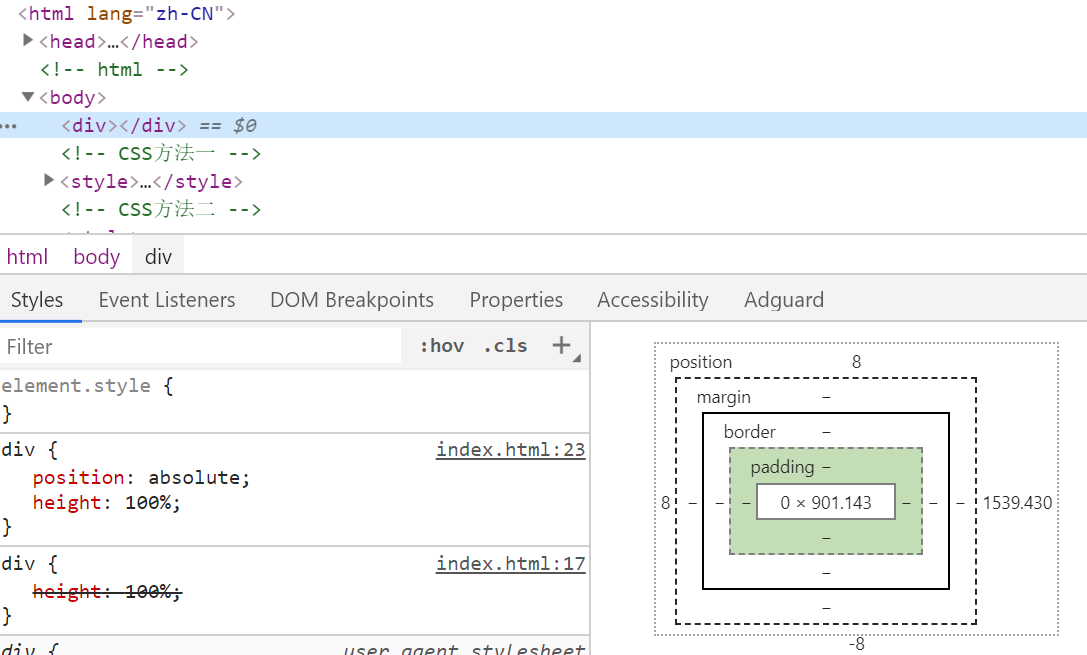
任意高度元素展开
缺点是,如果高度太大会造成展开过快和收回延迟,所以这个足够大的值尽量适当。
<!-- html -->
<div></div>

<!-- CSS -->
<style>
    div {
        max-height: 0;
        overflow: hidden;
        transition: max-height .25s;
    }
    div.active {
        max-height: 666px;  /* 需要足够大的值 */
    }
</style>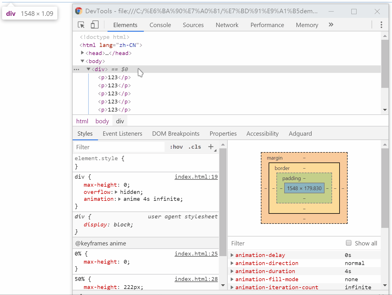
优雅的图片未加载或加载失败效果
需要注意的是,图片显示完毕后,img会成为“替换元素”,而替换元素是无法设置伪元素的,因为content内容被图片替换掉了;还需要注意attr里面的变量不能加双引号。
<!-- html -->
<div>
    <img src="demo.gif" alt="lululu">
</div>

<!-- CSS -->
<style>
    div {
        width: 100px;
        height: 100px;
        overflow: hidden;
    }
    img {
        display: inline-block;
        width: 100%;
        height: 100%;
        position: relative;
    }
    img::after {
        /* 生成 alt 信息 */
        content: attr(alt);
        /* 尺寸和定位 */
        position: absolute; left: 0;bottom: 0;right: 0;
        /* 颜色 */
        background-color: rgba(0,0,0,.5);
        /* alt 信息隐藏 */
        transform: translateY(100%);
        /* 过渡动画效果 */
        transition: transform .2s;
        }
        img:hover::after {
        /* alt 信息显示 */
        transform: translateY(0);
    }
</style>
CSS的悬浮图片替换效果
需要注意的是,如果右键保存图片,保存的是src内的图片,而不是替换之后的。
<!-- html -->
<img src="demo.gif">

<!-- CSS -->
<style>
    img:hover {
        content: url(amazing.gif);
    }
</style>
利于SEO的“替换元素”标题logo
用h1的原因主要是因为SEO,语义化的问题。
<!-- html -->
<h1>Weismann's blog</h1>

<!-- CSS -->
<style>
    h1 {
        content: url(logo.gif);
    }
</style>
高兼容、自动等宽、底部对齐的柱状图
需要注意的是,第一个i不能换行,换行后会产生后移的结果。
<!-- html -->
<div class="box"><i class="bar"></i>
    <i class="bar"></i>
    <i class="bar"></i>
    <i class="bar"></i>
</div>

<!-- CSS -->
<style>
    .box {
        width: 256px;
        height: 256px;
        text-align: justify;
    }
    .box:before {
        content: "";
        display: inline-block;
        height: 100%;
    }
    .box:after {
        content: "";
        display: inline-block;
        width: 100%;
    }
    .bar {
        display: inline-block;
        width: 20px;
        /* height自定 */
    }
</style>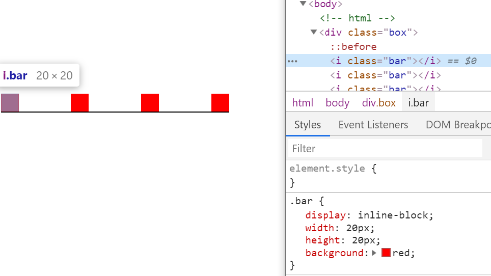
高兼容性的加载效果
在IE6-IE9下是…,其它都是动态的;使用dot的目的是语义化和低版本浏览器的兼容。
<!-- html -->
正在加载中<dot>...</dot>

<!-- CSS -->
    <style>
    dot {
        display: inline-block;
        height: 1em;
        line-height: 1;
        text-align: left;
        vertical-align: -.25em;
        overflow: hidden;
    }
    dot::before {
        display: block;
        content: '...\A..\A.';
        white-space: pre-wrap;
        animation: dot 3s infinite step-start both;
    }
    @keyframes dot {
        33% { transform: translateY(-2em); }
        66% { transform: translateY(-1em); }
    }
</style>
增大点击区域
第一种主要利用了内联元素的padding只会影响外观和不影响布局的特点;第二种针对其他属性会改变背景图定位的一种方式。
<!-- html -->
<a href="">demo</a>

<!-- CSS1 -->
<style>
    a {
        padding: 20px 0;
    }
</style>
<!-- CSS2 -->
<style>
    a {
        border: 11px solid transparent;
    }
</style>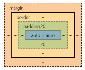
不使用伪元素的“三道杠”和”圆点“效果
<!-- html -->
<i class="icon"></i>

<!-- CSS三道杠 -->
<style>
    .icon {
        display: inline-block;
        width: 140px; height: 10px;
        padding: 35px 0;
        border-top: 10px solid;
        border-bottom: 10px solid;
        background-color: currentColor;
        background-clip: content-box;
    }
</style>
<!-- CSS三道杠2 -->
<style>
    .icon {
        width: 120px;
        height: 20px;
        border-top: 60px double;
        border-bottom: 20px solid;
    }
</style>
<!-- CSS圆点 -->
<style>
    .icon {
        display: inline-block;
        width: 100px; height: 100px;
        padding: 10px;
        border: 10px solid;
        border-radius: 50%;
        background-color: currentColor;
        background-clip: content-box;
    }
</style>
导航栏去除右边多余尺寸
利用margin来改变尺寸,需要注意,改变尺寸的元素水平方向的尺寸不能是确定的。
<!-- html -->
<div>
    <ul>
        <li></li>
        <li></li>
        <li></li>
    </ul>
</div>

<!-- CSS -->
<style>
    div {
        width: 380px;
    }
    ul {
        margin-right: -20px;
    }
    ul > li {
        float: left;
        width: 100px;
        margin-right: 20px;
    }
</style>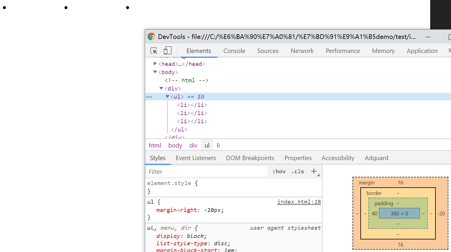
正确的滚动底部留白方式
如果使用padding留白,在Firefox和IE不会显示。
<!-- html -->
<div class="box">
    <img src="demo.gif">
</div>

<!-- CSS -->
    <style>
    .box {
        height:200px;
        overflow:auto;
    }
    .box>img {
        margin: 50px 0;
    }
</style>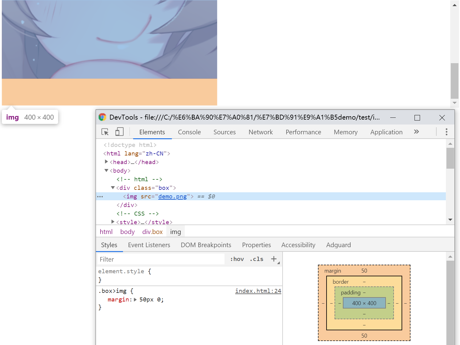
高兼容的多栏等高
注意container高度不能是确定值,缺点是如果在内部使用锚点定位会出现问题。
<!-- html -->
<div class="container">
    <div id="colLeft" class="column-left">
        <h4>正方观点</h4>
        <p>观点1</p>
        <p>观点1</p>
    </div>
    <div id="colRight" class="column-right">
        <h4>反方观点</h4>
        <p>观点1</p>
    </div>
</div>

<!-- CSS -->
<style>
    .container {
        overflow: hidden;
    }
    .column-left,
    .column-right {
        margin-bottom: -9999px;
        padding-bottom: 9999px;
        width: 50%;
        float: left;
    }
    .column-left {
        background-color: #34538b;
    }
    .column-right {
        background-color: #cd0000;
    }
</style>
正确的块级元素右对齐
auto值对于margin来讲是占用剩余的空间。
<!-- html -->
<div>demo</div>

<!-- CSS -->
<style>
    div {
        width: 100px;
        margin-left: auto;
    }
</style>
图片上传增加框
此技巧主要说明border的颜色默认是继承自color的
<!-- html -->
<div class="add"></div>

<!-- CSS -->
<style>
    .add {
        display: inline-block;
        width: 76px; height: 76px;
        color: #ccc;
        border: 2px dashed;
        text-indent: -12em;
        transition: color .25s;
        position: relative;
        overflow: hidden;
    }
    .add:hover {
        color: #34538b;
    }
    .add::before, .add::after {
        content: '';
        position: absolute;
        top: 50%;
        left: 50%;
    }
    .add::before {
        width: 20px;
        border-top: 4px solid;
        margin: -2px 0 0 -10px;
    }
    .add::after {
        height: 20px;
        border-left: 4px solid;
        margin: -10px 0 0 -2px;
    }
</style>
不影响背景图片位置设置边距
和增加点击区域第二种方式一样
<!-- html -->
<div class="box"></div>

<!-- CSS -->
<style>
    .box {
        display: inline-block;
        width: 100px;
        height: 100px;
        border-right: 50px solid transparent;
        background-position: 100% 50%;
    }
</style>
border制作梯形,各种三角形
<!-- html -->
<div></div>

<!-- CSS梯形 -->
<style>
    div {
        width: 10px; height: 10px;
        border: 10px solid;
        border-color: #f30 transparent transparent;
    }
</style>
<!-- CSS三角 -->
<style>
    div {
        width: 0;
        border-width: 10px 20px;
        border-style: solid;
        border-color: #f30 transparent transparent;
    }
</style>
<!-- CSS直角三角 -->
<style>
    div {
        width: 0;
        border-width: 10px 20px;
        border-style: solid;
        border-color: #f30 #f30 transparent transparent;
    }
</style>
高兼容双栏,一边等宽一边自适应,等高布局
缺点是border不支持百分比,最多2-3栏。
<!-- html -->
<div class="box">
    <nav>
        <div>123</div>
        <div>123</div>
        <div>123</div>
    </nav>
    <section>
        <div>1234</div>
    </section>
</div>

<!-- CSS -->
<style>
    .box {
        border-left: 150px solid #333;
        background-color: #f0f3f9;
    }
    .box::after {
        content: "";
        display: block;
        clear: both;
    }
    .box > nav {
        width: 150px;
        margin-left: -150px;
        float: left;
    }
    .box > section {
        overflow: hidden;
    }
</style>
内联元素“近似”垂直居中
至于为什么说“近似”,一句话说不清楚,请看开头
<!-- CSS -->
<style>
    span {
        line-height: 24px;
    }
</style>
多行内容“近似”垂直居中
<!-- html -->
<div class="box">
    <div class="content">基于行高实现的...</div>
</div>

<!-- CSS -->
<style>
    .box {
        width: 120px;
        line-height: 120px;
        background-color: #f0f3f9;
    }
    .content {
        display: inline-block;
        line-height: 20px;
        margin: 0 20px;
        vertical-align: middle;
    }
</style>
容器内图片的垂直方向间隙问题
产生的问题和“幽灵空白节点”和x-height有关,你可以尝试在img前加入x字符观察一下。
<!-- html -->
<div class="box">
    <img src="demo.gif">
</div>

<!-- CSS -->
<style>
    .box {
        width: 280px;
        outline: 1px solid #aaa;
        text-align: center;
        /* 解决方案1 */
        font-size: 0;
        /* 解决方案2 */
        line-leight: 0;
    }
    .box > img {
        height: 96px;
        /* 解决方案3 */
        display: block;
    }
</style>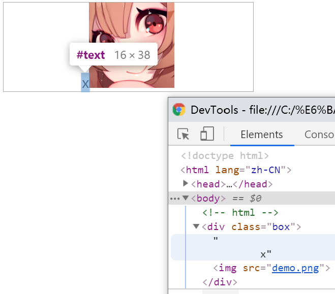
图标文字对齐
特点是文字大小的改变不会影响对齐。ex代表的是x-height的高度,根据x字形的不同(如font-family)而不同。
<!-- 方式一 -->
<!-- html -->
<div class="box">
    <p>
        <i class="icon icon-demo"></i>拉拉
    </p>
</div>

<!-- CSS -->
<style>
    .box {
        /* 根据图片大小变化 */
        line-height: 20px;
    }
    p {
        font-size: 40px;
    }
    .icon {
        display: inline-block;
        width: 20px;
        height: 20px;
        white-space: nowrap;
        letter-spacing: -1em;
        text-indent: -999em;
    }
    .icon::before {
        /* 低版本IE7兼容 */
        content: '\3000';
    }
    .icon-demo {
        background: url(demo.png) no-repeat center;
    }
</style>

<!-- 方式二 -->
<!-- html -->
<p>文字 <img src="delete.png"></p>

<!-- CSS -->
<style>
    p {
        font-size: 14px;
    }
    p > img {
        width: 16px; height: 16px;
        vertical-align: .6ex;
        position: relative;
        top: 8px;
    }
</style>
永远居中的弹框
特点是内容和浏览器尺寸变化都是自动变换大小和位置,可以通过伪元素的height控制上下位置。
<!-- html -->
<div class="container">
    <div class="dialog">demo</dialog>
</div>

<!-- CSS -->
<style>
    .container {
        position: fixed;
        top: 0; right: 0; bottom: 0; left: 0;
        background-color: rgba(0,0,0,.5);
        text-align: center;
        font-size: 0;
        white-space: nowrap;
        overflow: auto;
    }
    .container::after {
        content: '';
        display: inline-block;
        height: 100%;
        vertical-align: middle;
    }
    .dialog {
        display: inline-block;
        vertical-align: middle;
        text-align: left;
        font-size: 14px;
        white-space: normal;
        /* 弹框样式 */
        padding: 10px 14px;
        border: 1px solid #000;
        border-radius: 4px;
        background: #fff;
    }
</style>
文字环绕图片
float的真正用途。
<!-- html -->
<div class="box">
    <div>
        <img src="demo.gif">
    </div>
    <p>demo,demo,demo,demo,demo,demo,demo</p>
</div>

<!-- CSS -->
<style>
    .box {
        width: 100px;
    }
    img {
        float: left;
        width: 40px;
        height: 40px;
    }
</style>
利用overflow:hidden自定义滚动条
事实上overflow:hidden是可以滚动的,可以通过锚点、focus、scrollTop滚动。滚动条的实现请自行发挥。
通过label实现的选项卡效果
与锚点不同的是不会触发由内到外(多层滚动造成的类似于事件冒泡的效果)的页面跳动(元素上边与窗体上边对齐),还支持Tab选项的效果;缺点是需要JS支持选中效果。
<!-- html -->
<div class="box">
    <div class="list"><input id="one">1</div>
    <div class="list"><input id="two">2</div>
    <div class="list"><input id="three">3</div>
    <div class="list"><input id="four">4</div>
</div>
<div class="link">
    <label class="click" for="one">1</label>
    <label class="click" for="two">2</label>
    <label class="click" for="three">3</label>
    <label class="click" for="four">4</label>
</div>

<!-- CSS -->
<style>
    .box {
        height: 10em;
        border: 1px solid #ddd;
        overflow: hidden;
    }
    .list {
        height: 100%;
        background: #ddd;
        position: relative;
    }
    .list > input {
        position: absolute; top:0;
        height: 100%; width: 0;
        border:0; padding: 0; margin: 0;
    }
</style>
“包含块”的绝对定位元素“一柱擎天”问题
<!-- html -->
<div class="father">
    <div class="son">拉拉</div>
</div>

<!-- CSS -->
<style>
    .father {
        position: relative;
        width: 20px;
        height: 20px;
    }
    .son {
        position: absolute;
        /* 解决方案 */
        white-space: nowrap;
    }
</style>
“无依赖绝对定位”的表单验证应用
在一个元素上如果单用(父元素的position属性均是默认)“position:absolute”,事实上元素将原地不动,最终会产生BFC。
<!-- html -->
<div class="group">
    <label class="label"><span class="star">*</span>邮箱</label>
    <div class="cell">
        <input type="email" class="input">
        <span class="remark">邮箱格式不准确(示意)</span>
    </div>
</div>
<div class="group">
    ...
</div>

<!-- CSS -->
    <style>
    .group {
        width: 300px;
    }
    .label {
        float: left;
    }
    .remark {
        position: absolute;
    }
</style>
主体页面侧边栏
利用text-align和fixed的组合;height置0和overflow隐藏目的是为了不影响主体的体验,而之所以绝对定位元素没有被隐藏的原因是“如果overflow不是定位元素,同时绝对定位元素和overflow容器之间也没有定位元素,则overflow无法对绝对定位元素进行剪裁。”—《CSS世界》。
<!-- html -->
<div class="alignright">
    <span class="follow"></span>
</div>

<!-- CSS -->
<style>
    .alignright {
        height: 0;
        text-align: right;
        overflow: hidden;
        background: blue;
    }
    .alignright:before {
        content: "\2002";
    }
    .follow {
        position: fixed;
        bottom: 100px;
        z-index: 1;
        width: 10px;
        height: 10px;
        border: 1px solid #000;
    }
</style>
不通过width和height设置窗体全占用?
利用top和bottom或left和right同时设置的时候会触发流体特性的特点;与通过”top:0;left:0;width:100%;height:100%;“相比,在设置margin、border、padding的时候不会溢出到窗体的外面(就算你想到box-sizing,那margin呢?);而之所以用span的原因是想说明绝对定位会将元素的display置为block。
<!-- html -->
<span></span>

<!-- CSS -->
<style>
    span {
        position: absolute;
        top:0;
        left:0;
        right:0;
        bottom: 0;
    }
</style>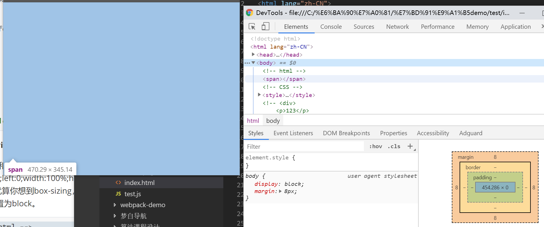
margin:auto水平垂直居中
<!-- html -->
<div></div>

<!-- CSS -->
<style>
    div {
        width: 300px; height: 200px;
        position: absolute;
        left: 0; right: 0; top: 0; bottom: 0;
        margin: auto;
    }
</style>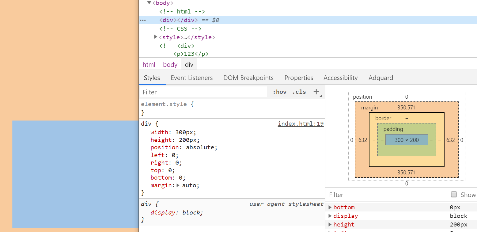
纸张卷边阴影
主要利用“position: relative;z-index: 0;”创建层叠上下文与z-index的负值将阴影置于“contaniner”和“page”之间。
你可以尝试将关键CSS去掉查看效果。
<!-- html -->
<div class="container">
    <div class="page">
        <h4>demo</h4>
        <p>demo</p>
    </div>
</div>

<!-- CSS -->
<style>
    .container {
        background-color: #666;
        height: 1000px;
        /* 创建层叠上下文,关键 */
        position: relative;
        z-index: 0;
    }
    .page {
        width: 600px;
        background-color: #f4f39e;
        background: linear-gradient(to bottom, #f4f39e, #f5da41 60%, #fe6);
        box-shadow: 0 2px 10px 1px rgba(0, 0, 0, .2);
        text-shadow: 0 1px 0 #f6ef97;
        position: relative;
        left: 200px;
        top: 200px;
    }
    .page:before {
        transform: skew(-15deg) rotate(-5deg);
        transform-origin: left bottom;
        left: 0;
    }
    .page:after {
        transform: skew(15deg) rotate(5deg);
        transform-origin: right bottom;
        right: 0;
    }
    /* 边角卷边阴影 */
    .page:before, .page:after {
        width: 90%; height: 20%;
        content: "";
        box-shadow: 0 8px 16px rgba(0, 0, 0, .3);
        position: absolute;
        bottom: 0;
        z-index: -1;
    }
</style>
隐藏文字
说这个主要是为了说明,Chrome浏览器如果字体设置12px以下的大小(新版本已经不限制了),会被自动处理成12px,但是有一个值除外,0。
<!-- CSS -->
<style>
    p {
        font-size: 0;
    }
</style>
解决text-decoration下划线和文本重叠
因为是内联元素,所以完全不用担心会影响元素高度的问题。
<!-- CSS -->
<style>
    a {
        text-decoration: none;
        border-bottom: 1px solid;
        padding-bottom: 5px;
    }
</style>
自动将输入的小写字母转换大写
<!-- CSS -->
<style>
    input {
        text-transform: uppercase;
    }
</style>
价格场景下的首个符号选择器
特点是可以让html结构显得干净
<!-- html -->
<p class="price">¥399</p>

<!-- CSS -->
<style>
    .price:first-letter {
        ...
    }
</style>
元素隐藏同时资源不加载
后续可通过script.innerHTML访问。
<!-- html -->
<script type="text/html">
    <img src="1.jpg">
</script>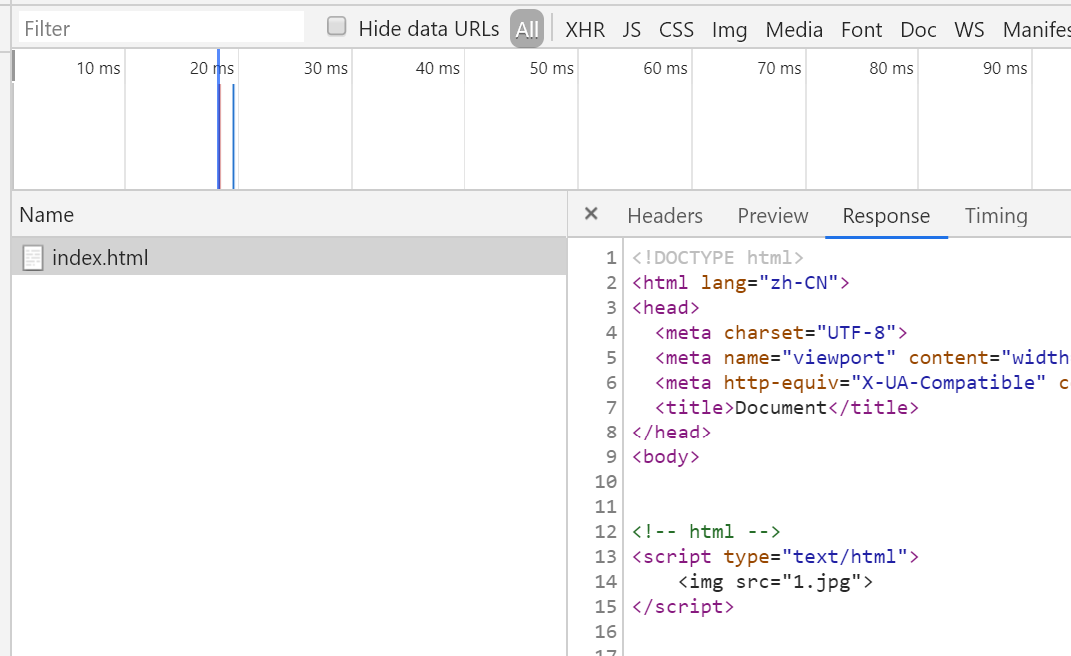
头像裁剪矩形镂空效果
主要利用outline。
<!-- html -->
<div class="crop">
    <div id="cropArea" class="crop-area"></div>
    <img src="demo.gif">
</div>

<!-- CSS -->
<style>
    .crop {
        width: 200px; height: 200px;
        overflow: hidden;
        position: relative;
    }
    .crop > .crop-area {
        position: absolute; top:0; height: 0;
        width: 80px; height: 80px;
        outline: 200px solid rgba(0,0,0,.5);
        cursor: move;
    }
</style>
自定义光标
需要注意IE只支持cur文件。
<!-- CSS -->
<style>
    .cursor-demo {
        cursor: url(demo.cur);
    }
</style>
修改水平流到垂直流
兼容到IE7;此应用涉及较多东西,所有水平流的特性都可以应用到垂直流中(比如水平居中变成了垂直居中)。
<!-- CSS -->
<style>
    .verticle-mode{
        writing-mode: tb-rl;
        -webkit-writing-mode: vertical-rl;
        writing-mode: vertical-rl;
    }
</style>